
Losing Mobile Visitors?
Responsive Web
Design Cambridge
That Works on
Every Screen
Over half your traffic is on a phone, but most sites were designed for desktop. We build mobile website design from the small screen up, so it works properly on the device people actually use.
Responsive Web Design Cambridge Built Mobile-First
As a Web Design Agency Cambridge that designs mobile-first by default, Doublespark builds every site for the small screen first, then scales up. You get a site that loads fast on 4G, works on any device people use today, and stays usable as new screen sizes arrive.
Explore Key Sections of This Page
What Is Responsive Website Design?
Responsive website design refers to the practice of building websites that automatically adapt to various screen sizes, resolutions, and devices.
This includes everything from mobile phones to tablets, laptops, and desktops—ensuring a consistent and optimised user experience regardless of how someone accesses your site.
Responsive design is a foundational principle in modern web development, helping to future-proof your digital presence and cater to an increasingly mobile-first audience.
Key Features of Responsive Website Design:
- Fluid grid layouts
Designs that use percentage-based columns, allowing the layout to scale naturally across screen sizes - Flexible images and media content
Visuals that resize dynamically without distortion to match the viewing environment - Media queries
CSS techniques that tailor layout and styles depending on the device’s resolution and orientation - Responsive navigation menus
Menus that collapse, expand or adapt to mobile-friendly formats for usability - Scalable typography
Fonts that remain readable across all devices, improving accessibility and engagement
Responsive design provides the perfect user experience—anytime, anywhere.
Why Responsive Design Matters
Over 60% of web traffic now comes from mobile devices - yet many websites still fail to deliver a smooth mobile experience.
Responsive design is essential not just for aesthetics, but for accessibility, engagement, and conversion. If your website isn’t mobile-friendly, you risk losing visibility, users, and ultimately, revenue.
- Improved search visibility thanks to Google’s mobile-first indexing
- Better engagement with intuitive layouts and faster interaction
- Higher conversion rates from visitors using smartphones and tablets
- Enhanced accessibility that supports all users, including those with impairments
- Future-proofing for upcoming screen sizes, devices, and technologies
“With the rise of mobile‑first indexing, Google prioritises mobile‑friendly websites in its rankings.”
Don’t lose visitors - design responsively and give every user the best experience.
Our Responsive Website Design Services
We offer a comprehensive range of responsive website design services tailored to help your brand thrive in a mobile-first world. Whether you need a new website built from scratch or want to retrofit an existing one for optimal performance across all devices, our solutions are rooted in best practices, technical precision, and user experience design.
Mobile-First Design
We build websites from a mobile-first perspective, ensuring they work flawlessly on smartphones and tablets before scaling up to desktops. This approach ensures maximum usability across all devices.
Adaptive Layouts
From multi-column desktop displays to stacked mobile views, we create fluid layouts that adapt to screen size without compromising content structure or user experience.
Cross-Browser & Device Testing
We rigorously test your website on major browsers and a variety of devices to ensure seamless functionality, load speed, and performance consistency across the board.
UX & UI Design
Our user interface and experience designs prioritise clarity, accessibility, and intuitive navigation - especially on smaller screens where every pixel counts.
Page Speed Optimisation
We compress media, optimise code, and implement caching strategies to ensure your responsive site loads quickly - crucial for mobile SEO and user retention.
Secure & Scalable Frameworks
Using modern frameworks like Bootstrap, Tailwind, and custom solutions, we build responsive sites that are secure, scalable, and easy to maintain.
CMS Integration
Whether you’re on WordPress, Shopify, or a custom CMS, we integrate responsive design best practices to ensure your content management remains intuitive and flexible.
Conversion-Focused Layouts
Our designs don’t just look good - they convert. We use data-led design decisions to enhance calls-to-action, lead forms, and contact options on all devices.
Our responsive website design services are built to future-proof your digital presence in an increasingly mobile-first world. From strategic wireframing and UX-focused interfaces to fast-loading, cross-device compatibility, we blend creativity with technical precision. Whether you're launching a new website or upgrading an existing one, we deliver secure, scalable, and conversion-focused solutions that perform across every screen size and platform.
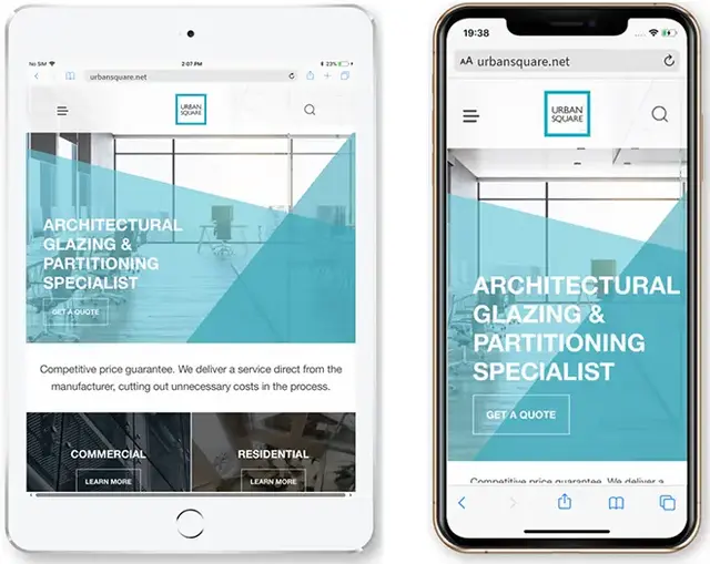

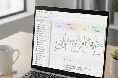
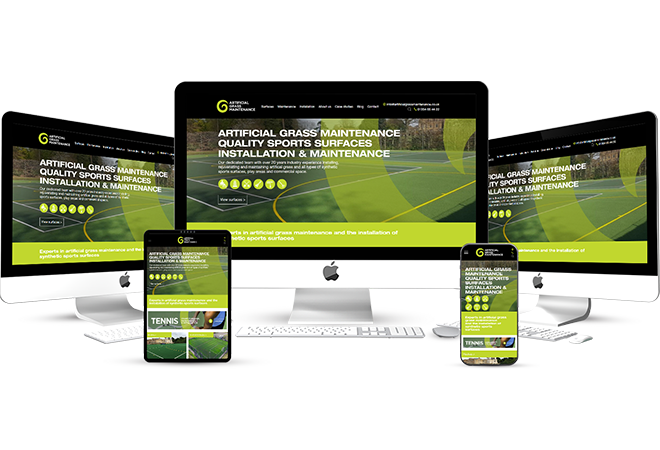
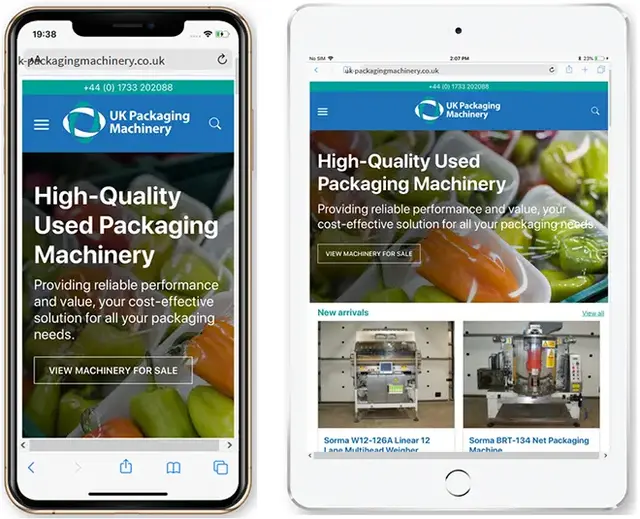
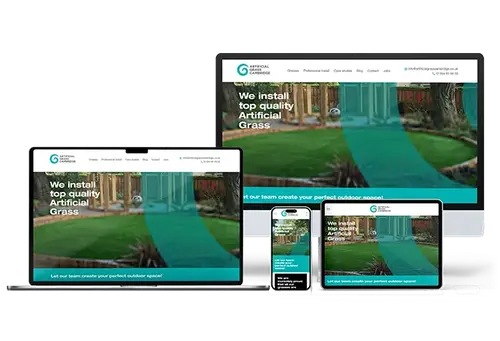
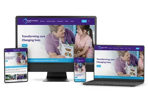
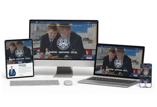
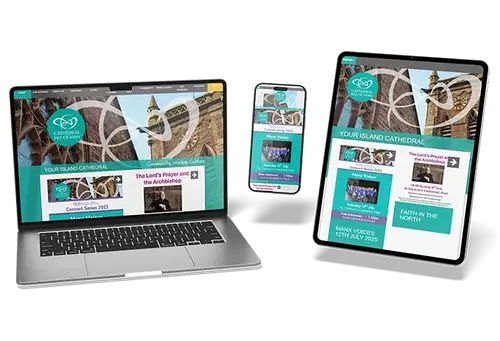
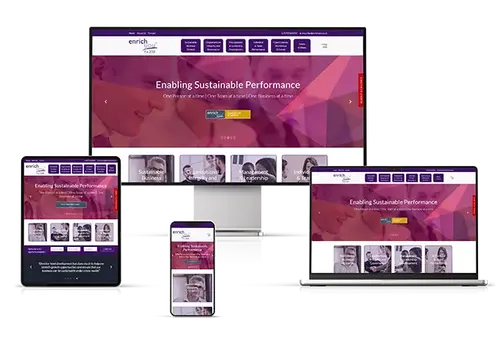
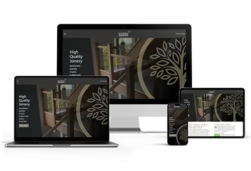
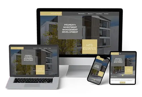
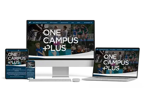
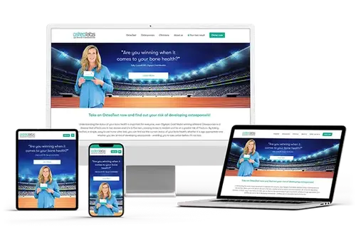
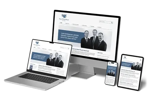
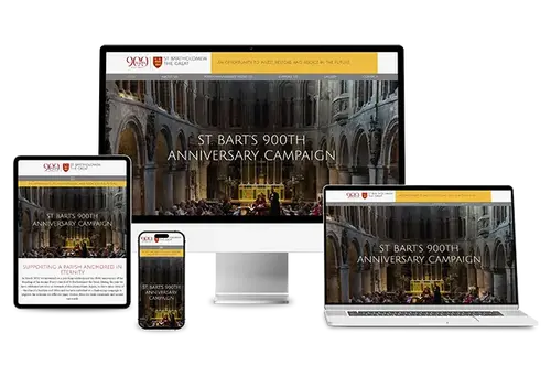
Our work
A selection of some of the websites we have designed, programmed, maintain or currently host:


Website Design Process
Our responsive design process ensures your website looks and functions perfectly on every device - whether desktop, tablet, or mobile.
Here’s how we deliver seamless, mobile-first web experiences:
-
Discovery Call
We begin with a detailed consultation to understand your brand identity, business objectives, and target users. This forms the foundation of our design decisions.
-
Wireframing
Low-fidelity wireframes are created to map out the layout and flow across different screen sizes, focusing on usability and user journey clarity.
-
Design & Prototyping
Our designers produce mobile-first mockups and interactive prototypes, allowing you to visualise the experience and user pathways before development begins.
-
Development
We code your site using cutting-edge responsive frameworks and best practices to ensure smooth performance and pixel-perfect visuals on all devices.
-
Testing
We rigorously test the design on real devices and emulators, fixing inconsistencies and optimising for speed, accessibility, and interactivity.
-
Launch & Support
Once live, we monitor how your site performs and offer continuous support and enhancements to keep it up to date and responsive to user needs.
Every step is designed to ensure your users enjoy a fluid, high-quality experience - wherever they are.

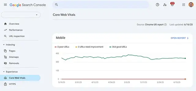
Recent Results
Our responsive website design services deliver measurable results by solving real-world mobile usability challenges for businesses in Cambridge and beyond.
Client: Local Estate Agent – Cambridge
Problem: Website unusable on mobile devices
Solution: Full mobile-first redesign and fast-loading theme
Result: Bounce rate on mobile dropped by 65%, lead generation increased 40%
Client: Ecommerce Brand – Cambridge
Problem: Poor checkout usability on smartphones
Solution: Responsive design overhaul and mobile-optimised cart
Result: Mobile conversions up 38% in 2 months
Client: Legal Services Firm – Cambridge
Problem: Inconsistent site experience across devices
Solution: Custom responsive rebuild and UX redesign
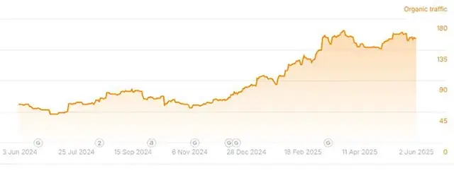
Result: 50% increase in organic mobile traffic within 90 days
These case studies demonstrate how a mobile-first approach directly impacts user engagement, conversions, and traffic. Whether your site suffers from slow load speeds, inconsistent device rendering, or poor mobile UX, our team will identify and resolve the barriers holding you back. We design with intent - ensuring every visitor, on every device, enjoys a seamless and high-performing user experience.
Tools & Technology We Use for Website Design
We don’t just design—we engineer responsive experiences using industry-leading tools and technologies that guarantee precision, performance, and consistency.
Our responsive web design toolkit includes:
Figma & Adobe XD
Used for wireframing, prototyping, and creating mobile-first design mockups that guide the entire development process.
Bootstrap & Tailwind CSS
Modern front-end frameworks that allow us to build fluid, responsive layouts with speed and flexibility.
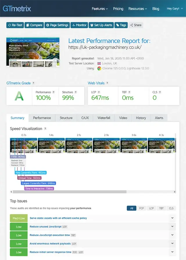
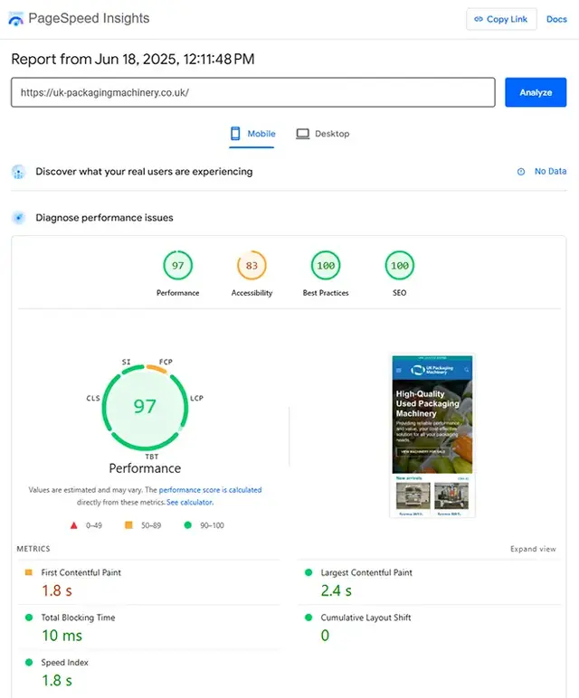
Google Lighthouse
Our go-to tool for auditing site performance, accessibility, and mobile usability based on real-world metrics.
BrowserStack & LambdaTest
Enable cross-browser and cross-device testing to ensure a consistent user experience on every screen size.
WebPageTest & GTmetrix
Used to diagnose and optimise page speed, providing detailed insights into how your site loads across devices.
Contao, WordPress, Magento & Shopify
CMS platforms we customise for responsive functionality while maintaining intuitive content management.
VS Code & GitHub
Empower our development workflow with robust code editing, version control, and team collaboration.
Animate.css & Framer Motion
Lightweight libraries that help us add smooth, engaging animations optimised for mobile devices.
Cloudflare & CDN Integrations
Improve mobile site speed, security, and uptime with content delivery networks and caching strategies.
HTML5, CSS3 & JavaScript
Core technologies that form the backbone of every responsive website we build.
By combining creative vision with these powerful tools, we deliver websites that excel across devices and deliver exceptional user experiences.
Industries We Support
A mobile-friendly website is no longer optional – it’s essential. Our responsive website design services ensure your site looks great, loads fast, and works flawlessly on every screen size, from smartphones to desktops.
We design with user experience at the core – reducing bounce rates, improving conversions, and meeting the expectations of mobile-first users. Whether you’re an ecommerce store, local business, or B2B brand, we create responsive sites that adapt to your audience’s behaviour and intent.
By combining UX best practices with fast, flexible code, we deliver mobile-optimised websites that perform in search and convert visitors into customers. Because great design isn’t just about how it looks – it’s about how it works, everywhere.
-
Professional Services
-
Hospitality & Leisure
-
Franchise Businesses
-
Manufacturing & Industrial
-
Education & Training
-
Property & Real Estate
-
Food & Beverage
-
Beauty & Cosmetics
-
Travel, Tourism & Attractions
-
Wellness, Fitness & Lifestyle
-
Construction & Skilled Trades
-
Logistics & Transport
Local Responsive Web Design
Today’s users expect flawless experiences on every device, whether they’re browsing at home, in a café, or on the go. Our responsive web design services help Cambridge businesses stand out locally by:
- Designing mobile-first layouts that ensure your local pages load beautifully on smartphones and tablets
- Creating clear, easy-to-navigate designs that highlight your Name, Address, and Phone (NAP) details for local visitors
- Integrating location-based content and visuals that resonate with your Cambridge audience
- Structuring service and city-specific pages for fast load times and intuitive navigation across devices
- Embedding Google Business Profile links and calls-to-action that work seamlessly on mobile devices
Whether you’re in the heart of Cambridge or part of its fast-growing tech and academic hubs, we make sure your website offers a responsive, local-first experience that drives engagement and conversions.
Benefits of Responsive Web Design
Responsive web design is essential for today’s multi-device world - ensuring your website adapts seamlessly to every screen size.
A responsive site not only improves user experience but also supports better performance, engagement, and conversion:
- Better User Experience
Visitors enjoy a consistent, intuitive experience whether they’re on mobile, tablet, or desktop - Higher Engagement Rates
Optimised layouts and navigation increase time on site and reduce bounce rates - Faster Load Speeds
Mobile-first design paired with performance optimisation delivers quicker load times across all devices - SEO & Google Visibility
Google rewards responsive sites with better rankings - especially for mobile searches - Future-Proof Flexibility
Responsive frameworks adapt to new screen sizes and tech, keeping your site relevant and effective
Responsive design isn’t just a trend - it’s a long-term investment in usability, performance, and future readiness.
Why Choose Doublespark for Responsive Website Design?
We’re not just developers - we’re responsive design specialists with the technical know-how and user-first mindset to help your site thrive on any device:
- Cambridge-based expertise: Over 15 years of experience designing high-performance websites for businesses across the UK
- Mobile-first, UX-led development: Every build prioritises usability, accessibility, and performance across all screen sizes
- Data-informed decisions: We use analytics, user behaviour, and performance data to guide design structure and layout
- Transparent project delivery: You’ll receive clear timelines, scoped deliverables, and open communication from start to finish
- Post-launch support: We continue to monitor, test, and optimise your site to keep it running flawlessly long after go-live
“Doublespark made our site not only look great on mobile, but also load faster and perform better across the board.” - Satisfied client, Cambridge

What Our Clients Are Saying
5-Star Google Reviews That Reflect Our Commitment to Excellence
-
2 months ago
I have been with Doublespark since 2012. As a Cambridge SEO company they supported the online shop and the online marketing, helping more clients find and book our services. Gary has always been willing to help with any issues on the website and has been quick to respond when I have asked for any updates or changes to be made to the website. Highly Recommended
-
4 months ago
Great company to work with, on hand with tech queries and very proactive when an very rare issue arises.
-
6 months ago
Doublespark have looked after website maintenance and hosting for osteolabs since 2021. They keep the site running smoothly, deal with updates behind the scenes, and respond quickly whenever we need support.
-
8 months ago
most excellent people - helpful, knowledgeable and efficient.
-
9 months ago
Gary and the team at Doublespark are brilliant, we've worked together on a lot of very different digital marketing projects over a good many years. Always good results, always a good experience.
Website Design News, Trends and Insights Shaping Digital Experience

The Figma Web Design Process
Figma brings clarity to the parts of a website project that often cause friction. Instead of static PDFs and scattered emails, everyone works in a shared space with live designs, pinned comments, and clickable journeys.

How AI Is Redefining Web Design
AI has moved from being a back‑office helper to becoming part of the user experience itself. This long‑form guide explains how AI is influencing website design and development today, with practical examples.
FAQs About Our Web Design Services
What is responsive website design and why does it matter for Cambridge businesses?
Responsive website design ensures that your site adapts seamlessly to different screen sizes and devices, providing a consistent user experience. For businesses in Cambridge, where customers increasingly browse on smartphones and tablets, responsive design is crucial for reaching and retaining a wider audience.
Adapting to User Behaviour
Modern consumers expect websites to work flawlessly whether they’re using a laptop, tablet, or mobile phone. A site that doesn’t adapt can frustrate users, leading to higher bounce rates and missed opportunities. Responsive design addresses this by adjusting content, layout, and functionality based on device specifications.
Boosting Local Visibility
Search engines like Google prioritise mobile-friendly websites in their rankings. For Cambridge businesses aiming to stand out in local search results, having a responsive site improves both visibility and credibility, helping you connect with more potential customers in your area.
Ensuring your website is fully responsive is no longer optional—it’s a vital step towards building trust, enhancing user experience, and driving more engagement across Cambridge.
Give your local audience the seamless online journey they expect and deserve.
How does mobile-first design differ from responsive design?
Mobile-first design and responsive design are closely related but differ in their initial approach to web development. Understanding this difference is key for Cambridge businesses aiming to maximise their online impact.
Mobile-First Prioritisation
Mobile-first design starts by designing for the smallest screens first, ensuring that essential elements are prioritised and user experience is optimised for mobile users. Only after the mobile experience is perfected does the design scale upwards to accommodate larger devices like tablets and desktops.
Responsive Adaptation
Responsive design, meanwhile, ensures that a website's layout automatically adjusts to fit the screen size, whether it’s built mobile-first or desktop-first. It's a broader approach focused on fluidity and flexibility across all devices.
Both strategies are critical, but for businesses in Cambridge where mobile traffic often outpaces desktop visits, adopting a mobile-first mindset ensures a more focused, user-centric online presence. Prioritising mobile users leads to better performance, greater engagement, and higher conversions.
Why is responsive design essential for SEO?
Search engine optimisation (SEO) and responsive web design are closely linked. If you're aiming to increase visibility for your Cambridge business, understanding the SEO benefits of responsive design is crucial.
Mobile-First Indexing
Google now uses the mobile version of your site as the primary basis for indexing and ranking. A non-responsive site risks lower rankings simply because it does not offer a seamless mobile experience, which Google prioritises.
Improved User Engagement
Responsive websites tend to have lower bounce rates and longer session durations—two factors that search engines view favourably. If users enjoy interacting with your site, search engines reward you with better placement in search results.
Faster Load Times
Page speed is a confirmed ranking factor, and responsive designs, when optimised properly, load quickly across all devices. This further enhances SEO efforts by meeting user expectations and Google's performance standards.
A responsive website not only looks better and functions more effectively but also gives your Cambridge business a competitive edge in search engine rankings. By prioritising responsive design, you're investing directly in your site's online success.
How long does it take to create a responsive website?
One of the most common questions we get from Cambridge businesses is how long it takes to design and build a fully responsive website. While timelines can vary, understanding the key stages will help you plan effectively.
Discovery and Planning Phase
This stage involves gathering requirements, analysing user needs, and outlining a project plan. For most businesses, this can take one to two weeks, depending on the complexity of the site and the clarity of your goals.
Design and Development Phase
Wireframing, designing, coding, and developing the responsive features typically take between four to eight weeks. Factors such as the number of pages, desired functionality, and revisions requested can influence the timeline.
Testing and Launch Phase
Before launch, extensive testing is conducted across multiple devices and browsers. This process usually takes one to two weeks to ensure everything performs as expected without any glitches.
From start to finish, most responsive websites for Cambridge businesses can be completed within six to twelve weeks, provided communication remains clear and feedback is prompt.
Planning ahead and collaborating closely with your web design team helps ensure a smooth and timely launch.
Will my existing website need a full rebuild to become responsive?
Many Cambridge businesses wonder whether making their website responsive requires starting from scratch. The answer depends on your current site’s structure, platform, and design approach.
Minor Adjustments vs. Full Redesign
If your site is relatively new and built on a flexible CMS like WordPress or Shopify, it may only require updates to the theme, CSS media queries, and layout settings to achieve full responsiveness.
When a Full Rebuild Is Necessary
Older websites, especially those built without mobile considerations, often require a complete redesign to meet today’s responsive standards. In such cases, rebuilding offers the opportunity to refresh the visual design, update content, and improve technical performance all at once.
While some websites can be retrofitted for responsiveness, others will benefit more from a comprehensive rebuild that modernises both appearance and functionality.
Investing in a fully responsive design ensures your Cambridge business stays competitive and future-ready.
Can you design a responsive ecommerce site?
Absolutely! Many Cambridge businesses we work with require fully responsive ecommerce websites that provide flawless shopping experiences across all devices. Responsive ecommerce is vital for maximising sales and customer satisfaction.
Mobile Shopping Trends
More than half of ecommerce traffic now comes from mobile devices. Ensuring your product pages, checkout process, and navigation are mobile-optimised is essential for converting visitors into customers.
Customised Solutions
We work with popular platforms like Shopify, WooCommerce, and Magento, building custom responsive themes that are designed to drive engagement and streamline purchases across every screen size.
Speed and Usability
Fast load times, clear product images, intuitive filters, and easy checkout flows are the pillars of successful mobile ecommerce design. We build with these principles at the forefront to maximise conversions.
A responsive ecommerce site isn’t just convenient—it’s expected. Deliver a flawless shopping experience to your Cambridge customers wherever they are, whenever they shop.
What platforms do you build responsive websites on?
Choosing the right platform for your responsive website depends on your business goals, content needs, and future growth plans. We offer flexible solutions for Cambridge businesses across a range of platforms.
Popular CMS Options
We specialise in platforms like Contao, WordPress, Shopify, and WooCommerce, integrating responsive frameworks into custom themes and templates that provide complete flexibility.
Custom Coded Solutions
For businesses with highly specific requirements, we offer custom-coded websites using HTML5, CSS3, and JavaScript, ensuring full control over responsiveness and performance.
Scalability and Flexibility
No matter the platform, our responsive designs are built with scalability in mind—giving you the freedom to expand, evolve, and enhance your online presence as your Cambridge business grows.
We tailor our platform recommendations to suit your unique goals, ensuring a responsive site that’s not just fit for today, but ready for tomorrow. Build your online foundation on a platform that supports growth, flexibility, and outstanding design.
How do you ensure a responsive website is fast and lightweight?
Speed is critical for both user experience and SEO, especially on mobile devices. Our approach to responsive web design for Cambridge businesses prioritises both performance and visual quality without compromise.
Efficient Coding Practices
We write clean, modular code that reduces page bloat and leverages modern CSS frameworks like Tailwind or Bootstrap. This keeps load times short and user experiences seamless.
Optimised Media Assets
Images are resized, compressed, and delivered using next-gen formats like WebP. Videos and other heavy assets are optimised or lazy-loaded to ensure they don’t slow down mobile experiences.
Performance Monitoring
We utilise tools like Google Lighthouse, GTmetrix, and WebPageTest to identify performance bottlenecks and fine-tune every aspect of your site before it goes live.
By balancing design creativity with technical precision, we deliver fast, responsive websites that leave a lasting impression. Your Cambridge audience expects speed—let's make sure they get it.
How much does responsive website design cost?
Pricing for responsive web design in Cambridge can vary based on the size of the project, complexity of design, functionality requirements, and additional services like SEO or content writing. We believe in providing transparent, tailored quotes based on your exact needs.
Key Pricing Factors
The number of unique page designs, integration with third-party services, e-commerce features, and content migration are all elements that can influence costs. Simpler sites will naturally be more affordable than highly bespoke, feature-rich builds.
Investment vs. Expense
Responsive design should be viewed as an investment in your business's future growth. A professionally designed, mobile-optimised site can deliver substantial ROI by improving customer engagement, SEO rankings, and brand credibility.
We offer clear proposals with no hidden costs, ensuring you understand the value at every stage. Responsive web design is one of the smartest investments your Cambridge business can make for lasting success.
Do you offer post-launch support for responsive websites?
Yes, we believe that a successful website launch is just the beginning of your online journey. Ongoing support ensures your responsive website continues to perform at its best as technology, user expectations, and your business evolve.
Maintenance and Updates
We offer maintenance plans that include software updates, security patches, performance optimisation, and periodic testing across new devices and browsers to ensure continuous functionality.
Performance Monitoring
We track site performance metrics using tools like Google Analytics and Lighthouse, making proactive improvements where necessary to ensure your website remains fast, secure, and user-friendly.
Growth-Oriented Enhancements
As your Cambridge business expands, we’re here to help with additional features, content updates, and design refreshes to keep your site competitive and engaging.
Our goal is to be a long-term partner in your digital success, not just your web designer. Trust us to keep your website responsive, fast, and future-ready for years to come.
More Of Our Website Services
Serious about growth? Our SEO, PPC, and web services combine proven expertise with modern AI-aware optimisation. Explore what we can do for your business.