
Peterborough
Responsive/Mobile Website Design
More than half your Peterborough visitors arrive on a phone. We design responsive sites that load quickly and make tapping to call or buy effortless on any screen.
Responsive Web Design That Works for Peterborough Businesses
Tell us where your mobile experience is letting visitors down, whether that's slow pages or awkward navigation on small screens, and we'll rebuild it mobile-first. Responsive design sits inside our wider Peterborough Web design agency, so the team designing the experience can also build the site that delivers it.
Explore Key Sections of This Page
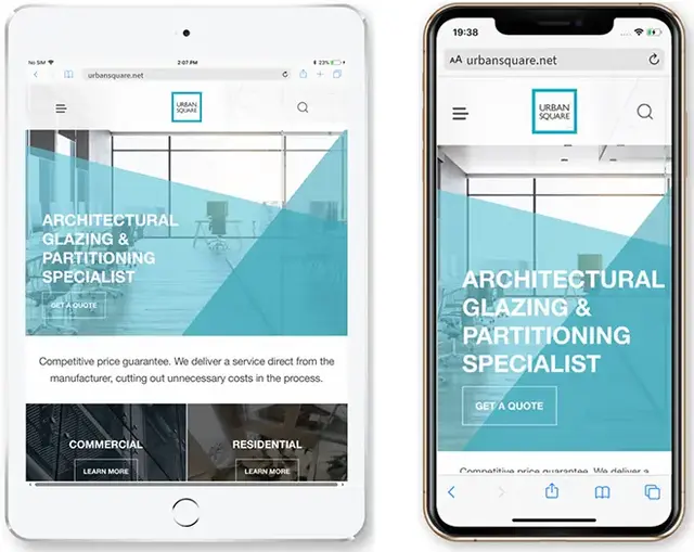
What Is Responsive Website Design?
Responsive website design is the process of creating websites that automatically adjust to different screen sizes, resolutions, and devices.
From smartphones in Peterborough city centre to tablets at home and desktop screens in the office, responsive design keeps your site clear, consistent, and easy to use no matter how it is accessed.
It is a core part of modern web development, helping your business stay competitive, improve usability, and support a mobile-first audience now and in the future.
Key Features of Responsive Website Design:
- Fluid grid layouts
Layouts built with flexible, percentage-based columns so pages scale smoothly across screen sizes - Flexible images and media content
Images and media that resize cleanly to fit the device without stretching or cropping issues - Media queries
CSS rules that adjust styling based on screen width, resolution, and orientation - Responsive navigation menus
Menus that adapt for touch screens, collapsing into mobile-friendly formats when needed - Scalable typography
Text that stays readable on smaller screens while maintaining balance and hierarchy on larger displays
With responsive design, your website delivers a reliable experience across Peterborough and beyond, wherever your customers are browsing.
Why Responsive Design Matters
More than 60% of website visits now happen on mobile devices - but plenty of sites still frustrate users with clunky layouts and hard-to-tap buttons.
For Peterborough businesses, responsive design is not just about how your site looks. It directly affects accessibility, user confidence, and how easily visitors can enquire, call, or buy. If your site is not mobile-friendly, you can lose rankings, leads, and revenue.
- Improved search visibility supported by Google’s mobile-first indexing approach
- Better engagement with layouts designed for touch, scrolling, and smaller screens
- Higher conversion rates by making key actions simple on phones and tablets
- Enhanced accessibility that helps all users, including those with impairments
- Future-proofing for new devices, screen sizes, and evolving user behaviour
“With the rise of mobile-first indexing, Google prioritises mobile-friendly websites in its rankings.”
Do not lose visitors - use responsive design and make every interaction effortless.
Our Responsive Website Design Services
We provide a complete range of responsive website design services to help Peterborough brands perform on every screen. Whether you are launching a new site or improving an existing one for better mobile usability, our work is built on proven best practice, clean development, and user-focused design.
Mobile-First Design
We design for smartphones first, making sure your website works perfectly on mobile and tablets before expanding the layout for larger desktop screens.
Flexible, Device-Friendly Layouts
From wide desktop layouts to streamlined mobile views, we create designs that adapt smoothly without losing structure, readability, or key content.
Cross-Browser and Device Testing
We test across major browsers and a wide range of devices to make sure your site stays fast, stable, and consistent for visitors in Peterborough and beyond.
UX and UI Design
We focus on clarity, accessibility, and intuitive navigation, especially on smaller screens where simple journeys and clear actions matter most.
Page Speed Improvements
We optimise images, streamline code, and implement caching to reduce load times, which supports mobile SEO, engagement, and conversion.
Secure, Scalable Builds
Using modern frameworks such as Tailwind, Bootstrap, and tailored solutions where needed, we build websites that are secure, scalable, and straightforward to maintain.
CMS Integration
Whether your site runs on WordPress, Shopify, or a bespoke CMS, we apply responsive best practice so your content remains easy to manage and looks right across devices.
Conversion-Focused Layouts
Responsive design should drive results, not just look good. We refine calls-to-action, enquiry forms, and contact routes so they work brilliantly on every device.
Our responsive website design service gives Peterborough businesses a dependable, future-ready site that performs across mobiles, tablets, and desktops. From wireframes and UX-led layouts to speed optimisation and cross-device testing, we combine creativity with technical detail to deliver secure, scalable, conversion-focused websites.

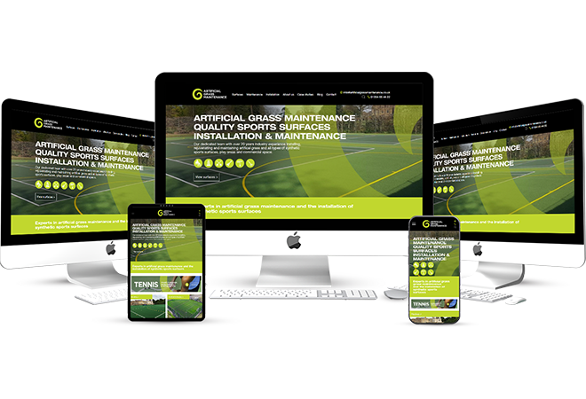
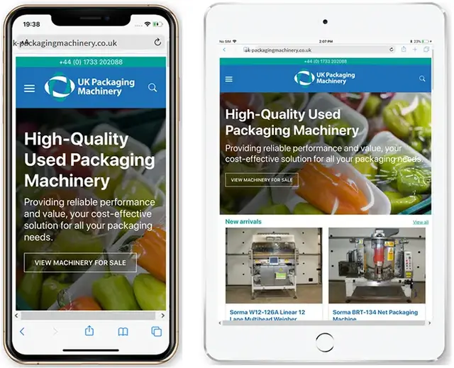
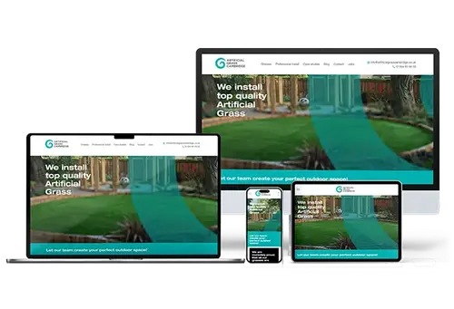
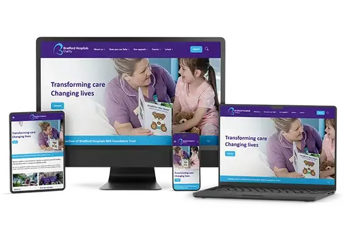
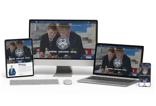
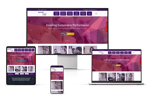
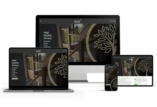
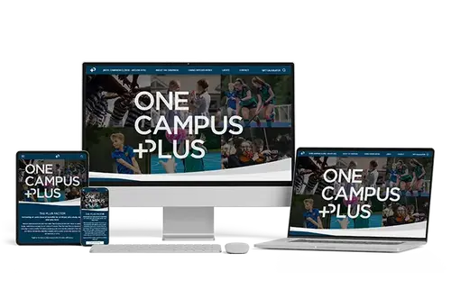
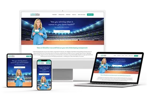
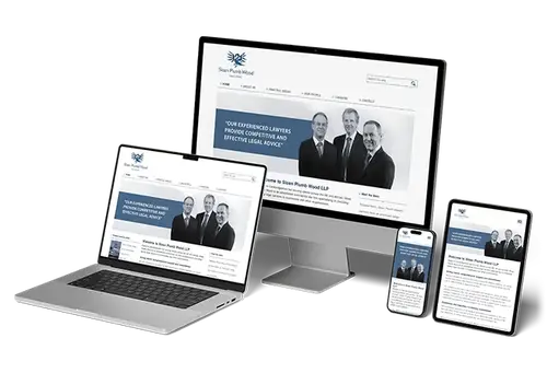
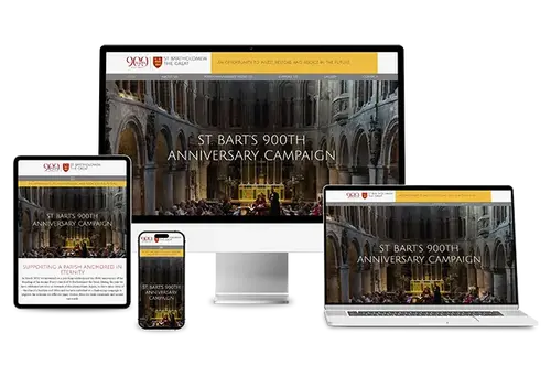
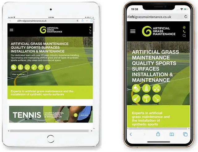
Our work
A selection of some of the websites we have designed, programmed, maintain or currently host:


Website Design Process
Our responsive design process makes sure your website looks right and works properly on every device - desktop, tablet, and mobile.
Here is how we create smooth, mobile-first web experiences for Peterborough businesses:
-
Discovery Call
We start with a focused consultation to understand your Peterborough audience, your goals, and what your website needs to achieve. This guides every decision that follows.
-
Wireframing
We produce clear wireframes to plan layout, content order, and key actions across screen sizes, keeping usability and user journeys front and centre.
-
Design and Prototyping
Next, we design mobile-first page layouts and prototypes so you can review the look, feel, and navigation before development begins.
-
Development
We build your site using responsive best practice, ensuring fast performance, clean code, and consistent visuals across devices.
-
Testing
We test on real devices and reliable emulators, resolving display issues and refining speed, accessibility, and interaction for a polished finish.
-
Launch and Support
After launch, we keep an eye on performance and provide ongoing support and improvements so your site stays responsive as devices and user expectations change.
Each stage is built around one goal - giving your users a smooth, high-quality experience wherever they are browsing.

Recent Results
Our responsive website design services create measurable improvements by fixing real mobile usability issues for businesses in Peterborough and the surrounding area.
Client: Local Estate Agent – Peterborough
Problem: Mobile users struggled to browse listings and contact the team
Solution: Mobile-first redesign with faster templates and simplified navigation
Result: Mobile bounce rate reduced by 61%, valuation enquiries increased 37%
Client: Ecommerce Retailer – Peterborough
Problem: Checkout friction on smartphones led to abandoned baskets
Solution: Responsive checkout rebuild and streamlined cart experience for mobile
Result: Mobile conversions increased 34% within 8 weeks
Client: Professional Services Firm – Peterborough
Problem: Inconsistent layout and usability across devices caused drop-offs
Solution: Responsive rebuild with UX improvements and clearer calls-to-action
Result: Organic mobile traffic increased 46% within 90 days
These results show how a mobile-first approach can improve engagement, conversion rates, and visibility. If your site loads slowly, displays inconsistently, or makes it difficult for mobile visitors to take action, we will identify what is getting in the way and fix it. Every layout decision is made with purpose, so users get a smooth, high-performing experience on every device.

Tools & Technology We Use for Website Design
We do not just design sites - we build responsive experiences using proven tools and technologies that deliver accuracy, speed, and consistency across every device.
Our responsive web design toolkit includes:
Figma and Adobe XD
Used for wireframes, prototypes, and mobile-first layouts that keep the build process clear and efficient.
Bootstrap and Tailwind CSS
Modern front-end frameworks that help us create flexible layouts quickly, without compromising quality.
Google Lighthouse
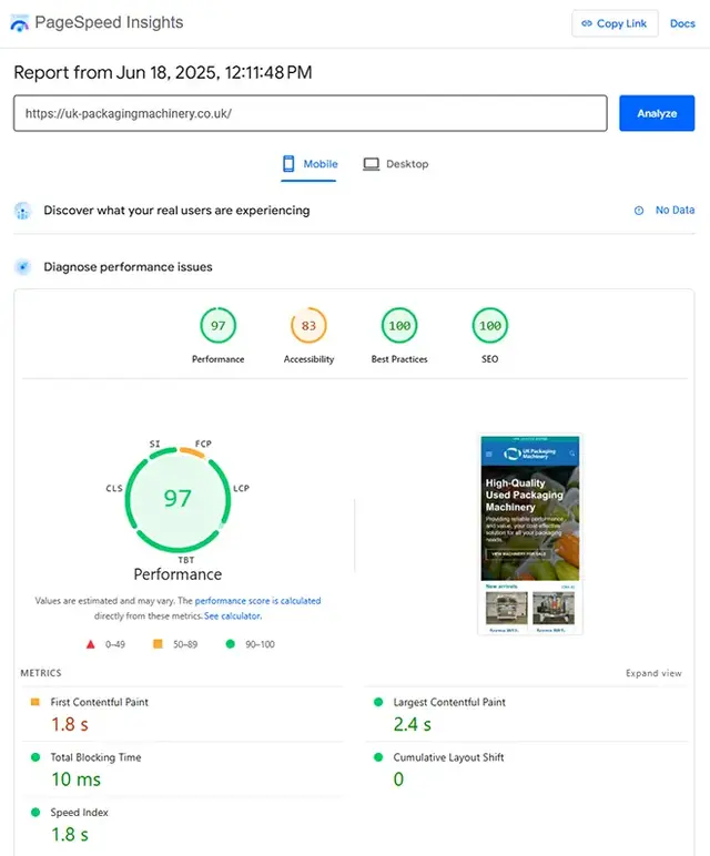
Used to audit performance, accessibility, and mobile usability using real-world metrics and clear scoring.
BrowserStack and LambdaTest
Allow thorough cross-browser and cross-device testing so your website stays consistent for users across Peterborough and beyond.
WebPageTest and GTmetrix
Used to diagnose load time issues and improve speed, with detailed reporting on mobile performance.
Contao, WordPress, Magento and Shopify
Platforms we tailor for responsive behaviour while keeping content management straightforward for your team.
VS Code and GitHub
Support a clean development workflow through reliable editing, version control, and collaborative delivery.
Animate.css and Framer Motion
Lightweight libraries that add smooth, purposeful animation without slowing down mobile users.
Cloudflare and CDN Integrations
Improve speed, security, and stability using caching and delivery optimisation, particularly for mobile browsing.
HTML5, CSS3 and JavaScript
The core technologies that power every responsive website we build.
By combining strong design standards with the right tooling, we deliver responsive websites that perform reliably across devices and provide an excellent experience for your audience.
Industries We Support
A mobile-friendly website is no longer a nice-to-have - it is essential. Our responsive website design service helps Peterborough businesses run a site that looks professional, loads quickly, and works smoothly on every screen size, from smartphones to desktops.
We design around user experience, reducing drop-offs, improving conversion rates, and meeting the expectations of mobile-first visitors. Whether you are running an ecommerce shop, a local service business, or a B2B company, we build responsive sites that match how your audience browses, compares, and takes action.
By combining UX best practice with fast, flexible code, we create mobile-optimised websites that support search performance and turn visits into enquiries and sales. Strong design is not only about appearance - it is about usability on every device.
-
Professional Services
-
Hospitality & Leisure
-
Franchise Businesses
-
Manufacturing & Industrial
-
Education & Training
-
Property & Real Estate
-
Food & Beverage
-
Beauty & Cosmetics
-
Travel, Tourism & Attractions
-
Wellness, Fitness & Lifestyle
-
Construction & Skilled Trades
-
Logistics & Transport
Local Responsive Web Design
Today’s users expect smooth, reliable experiences on every device, whether they are browsing at home, in a café, or on the move. Our responsive web design services help Peterborough businesses stand out locally by:
- Designing mobile-first layouts so your local pages display perfectly on smartphones and tablets
- Creating clear, easy navigation that makes it simple for visitors to find your Name, Address, and Phone (NAP) details
- Including Peterborough-focused content and visuals that feel relevant to local audiences
- Structuring service and area pages for fast load times and straightforward journeys across devices
- Embedding Google Business Profile links and calls-to-action that are easy to tap on mobile
Whether your customers are in Peterborough city centre or in nearby areas, we make sure your website delivers a responsive, local-first experience that drives engagement and enquiries.
Benefits of Responsive Web Design
Responsive web design is essential in a multi-device world - making sure your website adapts smoothly to every screen size.
A responsive site supports more than usability. It can improve performance, engagement, and conversion for Peterborough businesses:
- Better User Experience
Visitors get a consistent, easy experience whether they are on mobile, tablet, or desktop - Higher Engagement Rates
Clear layouts and intuitive navigation help users stay longer and reduce bounce rates - Faster Load Speeds
Mobile-first design paired with performance optimisation improves load times across devices - SEO and Google Visibility
Responsive websites are better suited to mobile search expectations and can support stronger rankings - Future-Proof Flexibility
Responsive frameworks adapt to new screen sizes and devices, keeping your site effective over time
Responsive design is not a passing trend - it is a long-term investment in usability, performance, and reliability.
Why Choose Doublespark for Responsive Website Design?
We are not just developers - we are responsive design specialists with the technical expertise and user-first approach to help your website perform on any device:
- Peterborough-focused support: Over 20 years of experience building high-performing websites for businesses across the UK, including local organisations in and around Peterborough
- Mobile-first, UX-led development: Every build prioritises usability, accessibility, and performance across all screen sizes
- Data-led improvements: We use analytics, user behaviour, and performance insights to shape structure, layout, and calls-to-action
- Clear project delivery: You get defined timelines, agreed deliverables, and straightforward communication from start to finish
- Post-launch support: We keep monitoring, testing, and refining your site so it continues running smoothly after launch
“Doublespark made our site easier to use on mobile, improved load times, and helped it perform better overall.” - Satisfied client, Peterborough

What Our Clients Are Saying
5-Star Google Reviews That Reflect Our Commitment to Excellence
-
2 months ago
I have been with Doublespark since 2012. As a Cambridge SEO company they supported the online shop and the online marketing, helping more clients find and book our services. Gary has always been willing to help with any issues on the website and has been quick to respond when I have asked for any updates or changes to be made to the website. Highly Recommended
-
4 months ago
Great company to work with, on hand with tech queries and very proactive when an very rare issue arises.
-
6 months ago
Doublespark have looked after website maintenance and hosting for osteolabs since 2021. They keep the site running smoothly, deal with updates behind the scenes, and respond quickly whenever we need support.
-
8 months ago
most excellent people - helpful, knowledgeable and efficient.
-
9 months ago
Gary and the team at Doublespark are brilliant, we've worked together on a lot of very different digital marketing projects over a good many years. Always good results, always a good experience.
Website Design News, Trends and Insights Shaping Digital Experience

The Figma Web Design Process
Figma brings clarity to the parts of a website project that often cause friction. Instead of static PDFs and scattered emails, everyone works in a shared space with live designs, pinned comments, and clickable journeys.

How AI Is Redefining Web Design
AI has moved from being a back‑office helper to becoming part of the user experience itself. This long‑form guide explains how AI is influencing website design and development today, with practical examples.
Peterborough Mobile/Responsive Web Design FAQs
What Does Responsive Web Design Mean for Peterborough Businesses?
Responsive website design means your pages automatically rearrange themselves to suit the device a visitor is using. Instead of forcing someone to pinch, zoom, or hunt for a menu link, the site responds to the screen size and input method. Buttons become easier to tap, text remains readable, images scale properly, and layouts flow naturally from wide desktop monitors to narrow mobile screens.
For Peterborough businesses, this matters because local customers do not browse in one place on one type of device. People might look up a tradesperson while commuting, compare services during a lunch break, or check opening times from a sofa in the evening. If the site feels awkward on a phone, those visitors often leave and try the next result. A responsive site removes friction so people can find what they need quickly and take action.
Matching How Local People Search
Mobile browsing is often intent-driven. Someone searching for a restaurant, a solicitor, a builder, or an ecommerce product usually wants an answer fast. Responsive design supports that behaviour by prioritising clarity: phone numbers are tappable, maps are easy to open, enquiry forms are short and readable, and key information such as service areas and opening hours stays visible without endless scrolling. When the journey is simple, more visitors turn into calls, enquiries, and sales.
Building Trust on Small Screens
First impressions happen quickly. If a page loads with tiny text, overlapping elements, or a menu that is difficult to use, it can make a business look less established. A well-built responsive layout feels modern and reliable, which is especially important for local services where trust drives decisions. Clear typography, consistent spacing, and touch-friendly navigation help visitors focus on your message instead of wrestling with the interface.
Supporting Local Visibility
Search engines place heavy emphasis on mobile usability. When your pages work well on phones, you are better placed to compete in local results for Peterborough searches. A responsive site also helps with consistent on-page information. Your address, phone number, and key service details should display cleanly on every device, making it easier for users to confirm they have found the right business and contact you without hesitation.
Good responsiveness can also improve engagement signals. When visitors can read, scroll, and interact comfortably, they are more likely to view multiple pages, spend longer on the site, and complete forms. Over time, those behaviour improvements can translate into stronger lead quality and a better return from both SEO and paid campaigns.
Reducing Waste and Maintenance
Without responsive design, some organisations try to manage separate versions of their site for mobile and desktop. That usually creates duplication, inconsistencies, and extra cost. A single responsive build is easier to maintain because content updates apply across devices and you are less likely to introduce errors. It also prepares your website for new screen sizes and browsing habits as they appear.
Ultimately, responsive design is about removing barriers between a local visitor and the action you want them to take. If your website is meant to generate enquiries, bookings, purchases, or footfall, it needs to feel effortless on the devices people actually use.
Give Peterborough customers a smooth, reliable experience on every device and make it easier for them to choose you.
Mobile-First vs Responsive - What Is the Difference?
Mobile-first design and responsive design are often mentioned together because they are compatible, but they describe different decisions in the build process. For many Peterborough organisations, knowing the distinction helps you set expectations, choose the right priorities, and avoid a site that looks fine on desktop but feels awkward on a phone.
What Mobile-First Really Means
Mobile-first is a planning and design philosophy. You begin by designing the smallest, most constrained version of the experience and make sure it works brilliantly. That forces focus. You have limited space, so you decide what matters most: the key message, the primary call-to-action, and the information a user needs to move forward. Navigation is simplified, forms are streamlined, and content is ordered so that the most useful sections appear first.
Once the mobile experience is strong, the layout is enhanced for larger screens. Rather than simply stretching content, you add improvements that make sense on desktops, such as multi-column sections, richer imagery, additional supporting content, or more advanced filtering. The core journey remains the same, but the presentation becomes more expansive as screen size increases.
What Responsive Design Covers
Responsive design is the technical and layout capability that allows a website to adapt to different screen sizes. It uses flexible grids, scalable media, and CSS breakpoints to adjust spacing, column structure, typography, and navigation patterns. A responsive site can be built with a mobile-first approach, but it can also be built desktop-first and then adjusted downwards.
That difference matters because desktop-first responsive projects can unintentionally treat mobile as an afterthought. The team designs a large-screen layout first, then compresses it, which often leads to cluttered pages, overlong forms, and small tappable targets. It might still be responsive in a technical sense, but it may not feel designed for mobile users.
How the Choice Affects Content and Features
Mobile-first thinking influences content choices as well as layout. It encourages shorter page sections, clearer headings, and prioritised information, so users can scan quickly. It also highlights where mobile users need different interactions, such as click-to-call buttons, sticky navigation, or simpler multi-step forms.
Which Approach Is Best for Peterborough Businesses?
In practice, the strongest outcomes usually come from combining both: design mobile-first, then build responsively. Peterborough audiences often discover local services on their phones, especially when searching for directions, opening times, comparisons, and quick quotes. If mobile users are your main source of enquiries, the site should be designed around their needs first, not squeezed into place later.
Mobile-first also supports performance. When you start small, you tend to choose lighter layouts, clearer content, and fewer unnecessary features. That can lead to faster load times and a smoother experience, which benefits both engagement and search visibility.
If you already have a website, you can still apply mobile-first thinking during a redesign. It may involve reordering content, simplifying navigation, and rewriting page sections so the most important information appears early and is easy to act on. The easiest way to validate the approach is to review prototypes on real phones before anything is built, so decisions are based on actual usability rather than assumptions.
Putting mobile users first usually produces a clearer journey, better performance, and stronger results across every device.
How Does Responsive Design Support SEO in Peterborough?
Responsive web design has a direct impact on SEO because search engines and users both judge your site by how well it works on mobile. If you want more visibility for Peterborough-related searches, you need pages that load quickly, display cleanly, and make it easy for visitors to complete tasks without frustration.
Mobile-First Indexing
Google primarily evaluates the mobile version of a page when deciding how to index and rank it. That means issues that only appear on phones can still hurt your overall performance, even if the desktop experience looks fine. Common problems include text that is too small, buttons placed too close together, content that overflows the screen, or elements that block the main content. A responsive build prevents those issues by ensuring layout and styling adapt properly at every breakpoint.
One URL, One Set of Signals
Responsive websites usually serve the same content from the same URL on every device. From an SEO perspective, that is simpler and stronger than having separate mobile and desktop versions. All links, shares, and engagement signals point to one page rather than being split across multiple versions. It also reduces the risk of mismatched content, missing structured data, or incorrect canonical tags that can confuse search engines.
Better Engagement and Behaviour Signals
While search engines do not publish an exact formula, user behaviour is still a reality. If people click through from a local search result and immediately leave because the page is difficult to use on mobile, you are unlikely to see stable gains. Responsive design improves readability, navigation, and task completion, which tends to increase time on site and the number of pages viewed. That creates a healthier overall performance profile for the site.
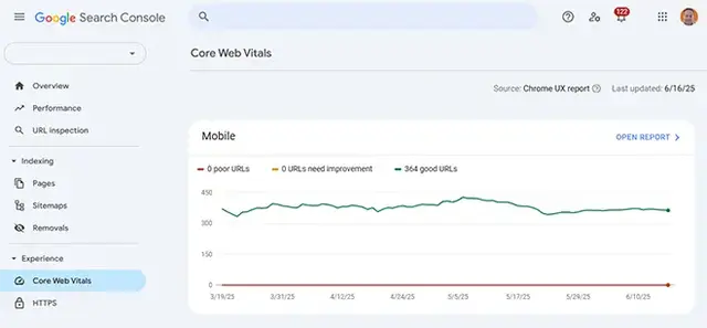
Speed and Core Web Vitals
Performance is a key part of modern SEO, especially on mobile networks. Responsive design should be paired with efficient code, sensible media handling, and smart loading strategies. When images are properly sized, scripts are controlled, and layouts are stable, your pages are more likely to meet Core Web Vitals expectations. For Peterborough businesses competing in local search, shaving even a second off mobile load time can make a noticeable difference to enquiries.
Cleaner Technical SEO
Responsive builds make technical SEO easier to manage. There is less chance of duplicate content issues, fewer redirects to maintain, and a simpler crawl path for search engines. It also becomes easier to keep schema markup, headings, internal links, and on-page copy aligned because there is one set of templates to maintain rather than separate desktop and mobile versions.
Local SEO Practicalities
Local visitors often need quick access to contact details, opening hours, directions, and service areas. If those elements are easy to find and interact with on mobile, you reduce drop-offs and improve conversion rates from local traffic. A responsive layout also helps keep your business information consistent across devices, which supports trust as well as SEO.
When your site is responsive, you are strengthening both usability and search performance, giving your Peterborough business a better chance to win clicks and turn them into customers.
What Is the Typical Timeline for a Responsive Website Project?
Timeframes for building a responsive website vary because every project has different content, functionality, and decision-making speed. For Peterborough businesses, the most reliable way to estimate delivery is to understand the stages involved, what happens in each one, and which parts most commonly create delays.
Discovery and Planning
The process typically starts with a focused discovery phase. We clarify your goals, the actions you want visitors to take, and the types of users you need to serve. This usually includes reviewing your existing site (if you have one), checking what is working and what is not, and mapping out the page structure. For a smaller brochure website, this stage can be completed in around one to two weeks. If there are multiple services, stakeholder input, or technical integrations, discovery can take longer because there are more decisions to make up front.
Content Preparation
Content is often the hidden driver of timelines. Responsive design relies on clear, well-structured copy and purposeful imagery, because mobile users scan quickly and need answers fast. If you are rewriting service pages for Peterborough audiences, updating case studies, or gathering new photos, we plan that work early. Content can run alongside design, but delays usually happen when copy and images arrive late or require multiple rounds of approvals.
Wireframing
Wireframes are simple layouts that show how each key page should flow, especially on mobile. They help settle practical questions such as where the main call-to-action sits, how navigation works, what information appears above the fold, and how visitors move from page to page. Wireframing is usually a few days to a week, depending on how many templates are required and how quickly feedback is provided.
Design and Prototyping
Design turns wireframes into branded, polished page layouts. We create mobile-first designs and then expand them for larger screens, ensuring typography, spacing, and buttons feel right across devices. If interactive prototypes are used, you can review how pages feel on a phone before anything is built. For many projects, this phase takes around two to four weeks, influenced by the number of unique page templates and the number of revision cycles.
Development
Development is where the designs become a working website. Templates are built, responsive behaviour is implemented, forms are configured, and any integrations are connected. A straightforward site can often be developed in two to four weeks. More complex projects, such as ecommerce, booking systems, member areas, or custom functionality, can extend this phase because there is more to build and test.
Testing and Launch
Testing is not a formality. We check the site across browsers and real devices, validate performance, and make sure pages remain usable at all common screen sizes. Accessibility and speed improvements are also handled here. Testing and refinement normally take one to two weeks. Launch then involves final backups, DNS and SSL checks, redirect mapping (if replacing an older site), and live monitoring after go-live.
As a typical range, many responsive website projects for Peterborough businesses complete within six to twelve weeks, depending on complexity and how quickly content and approvals move through the process.
When planning is tight and feedback is timely, you get a faster build, fewer revisions, and a smoother launch.
Can an Older Peterborough Website Be Made Responsive Without Rebuilding?
Not always. Whether your existing website needs a full rebuild to become responsive depends on how it was originally constructed, how flexible the platform is, and how much technical debt has built up over time. For Peterborough businesses, the right answer is usually found through a short audit that looks at layout, code quality, performance, and how easily the site can be updated without breaking mobile usability.
When a Retrofit Can Work
If your site is built on a modern CMS and uses a reasonably current theme or template system, it may be possible to make it fully responsive through targeted changes. That could include adding or refining CSS breakpoints, adjusting column layouts, improving typography scales, and replacing fixed-width elements with flexible equivalents. Sometimes, the biggest improvements come from cleaning up spacing, making buttons touch-friendly, and ensuring images scale properly.
A retrofit can also work when the design is still on-brand and the page structure is sensible. If the content is up to date and pages are logically organised, improving responsiveness can be a cost-effective way to modernise the experience without changing everything at once.
Signs That a Full Rebuild Is the Better Investment
Older sites often have fundamental limitations that make retrofitting slow and risky. Common issues include table-based layouts, outdated plugins, hard-coded fixed widths, and scripts that conflict with modern CSS. If the site is difficult to edit, has slow load times, or relies on unsupported components, the time spent trying to patch responsiveness can exceed the effort of rebuilding.
A rebuild is also recommended when the site no longer represents the business well. If your branding has changed, if services have expanded, or if the site is not converting, a new build gives you the opportunity to improve messaging, reorganise the user journey, and align the site with how people in Peterborough actually search and make decisions.
SEO, Redirects, and Risk Management
Rebuilds do not have to mean losing rankings, but they do require careful handling. If URLs change, redirects should be mapped properly, and key on-page content needs to be retained or improved. Even for a retrofit, we check that template changes do not accidentally hide content, break internal links, or introduce mobile rendering issues that could harm search performance.
Platform and Content Considerations
The platform matters. Some systems make responsive improvements straightforward, while others lock you into old templates. Content matters too. If pages are overloaded, poorly structured, or missing key local details such as service areas and clear contact routes, the project should address those problems rather than simply making the existing layout scale.
A Practical Way to Decide
The decision is usually based on three factors: effort, risk, and outcomes. If a retrofit delivers a genuinely good mobile experience quickly and safely, it can be the right move. If the work involves deep template surgery, ongoing compromises, and uncertain results, a rebuild becomes the more reliable option.
Whether we refine your current site or rebuild it, the goal is the same - a responsive Peterborough website that is fast, usable, and designed to convert.
Can You Build a Responsive Ecommerce Site That Converts on Mobile?
Yes. Responsive ecommerce design is one of the most important areas of responsive work because the buying journey is sensitive to friction. For Peterborough retailers and service providers selling online, the majority of browsing often happens on phones, even when final purchases sometimes occur on desktop. If product pages are hard to read or the checkout is awkward on mobile, revenue is lost quickly.
Mobile Shopping Expectations
Mobile shoppers expect speed, clarity, and confidence. They want to see product information without endless zooming, view images that load quickly, and move from browsing to checkout without repeated form filling. A responsive ecommerce site ensures product grids, filters, and navigation adjust to smaller screens so users can find what they want without frustration. It also keeps calls-to-action consistent, so adding to basket and checking out is always obvious.
Designing the Checkout for Phones
The checkout is where many sites fail on mobile. Responsive ecommerce focuses on touch-friendly inputs, sensible field order, and reduced distractions. Where possible, it uses address lookups, clear error messages, and short forms. Payment options also matter. The layout needs to support modern payment methods and ensure that trust signals, delivery information, and returns details remain visible and reassuring even on small screens.
Platform Support
We build and improve responsive ecommerce experiences on platforms such as Shopify, WooCommerce, and Magento, depending on your needs. The platform is only part of the story though. The theme, template structure, and performance choices are what determine whether the mobile experience is smooth. We focus on template consistency across key pages such as category listings, product detail pages, basket, checkout, and account areas.
Speed, Images, and Product Discovery
Online stores are often image-heavy, which can slow mobile experiences if not handled correctly. We ensure images are correctly sized for different devices and use modern formats where suitable. We also refine on-site search, filters, and sorting so visitors can locate products quickly. For businesses with a physical presence in Peterborough, we can also make collection and local delivery information easy to find and easy to use on mobile.
Trust, SEO, and Visibility
A responsive store supports visibility as well as usability. Mobile-friendly templates help product pages render cleanly for search engines, and consistent content across devices reduces technical issues. We also ensure key supporting pages such as delivery, returns, and contact details are easy to access, because that information plays a major role in converting mobile shoppers who want reassurance before they pay.
Testing for Conversion
Responsive ecommerce is validated by testing on real devices. We check the full journey from landing page to purchase confirmation, including edge cases like out-of-stock products, discount codes, and form errors. We also review analytics to identify points where mobile users drop off, then refine the design to reduce that friction. That consistency protects revenue and reduces support queries overall.
A responsive ecommerce site is not a luxury - it is the foundation of a smooth shopping experience that helps Peterborough customers buy with confidence wherever they are.
Which Platforms Are Best for Responsive Websites in Peterborough?
The best platform for a responsive website depends on what your Peterborough business needs today and what you want to be able to do in the next few years. Some organisations need a simple, easy-to-update brochure site. Others need ecommerce, integrations, or advanced content structures. Platform choice matters, but responsive quality ultimately comes from how templates are built, how content is structured, and how performance is handled.
CMS Platforms for Flexible Content
For many businesses, a content management system is the most practical option because it allows your team to update pages, add news, publish case studies, and manage media without developer involvement for every change. We commonly work with systems such as Contao and WordPress for service-led websites, and with ecommerce-focused platforms where appropriate. The key is not simply installing a theme, but shaping responsive templates around your content so pages remain consistent and readable on all devices.
We also pay attention to how editing works. If a platform encourages messy page-builder layouts, it can be harder to maintain strong responsiveness over time. Good template governance, reusable components, and sensible content rules help keep pages clean, consistent, and mobile-friendly as the site grows.
Ecommerce Platforms
If you sell products online, the platform needs strong catalogue and checkout capabilities. Responsive ecommerce requires careful theme work across product listings, product pages, basket, and checkout. The right choice will depend on product volume, fulfilment needs, and how much customisation you require. Regardless of platform, we focus on mobile usability so customers can browse, compare, and buy comfortably from a phone.
Custom Builds
When requirements are specific, a custom build can be the best approach. This might apply if you need a unique user journey, specialist integrations, or a fast, lightweight site with full control over the front-end. Custom builds are typically created using HTML5, CSS3, and JavaScript, and can still include a CMS for managing content. The advantage is precise control over performance, accessibility, and responsiveness, without being limited by a prebuilt theme or plugin ecosystem.
Hosting, Performance, and Security
A platform is only as good as the environment it runs in. Responsive sites still need fast hosting, correct caching, optimised media delivery, and strong security practices. We factor these requirements into the recommendation because they affect speed on mobile networks and the stability of your site during traffic spikes.
Migrations and Content Transfer
If you are moving from an older system, we plan the migration carefully. That includes content tidy-up, redirect mapping where URLs change, and checks to ensure the new responsive templates preserve or improve what already performs well. We can also provide guidance on how to publish new content without accidentally breaking mobile layouts.
How We Choose the Right Fit
Platform selection should be driven by real constraints: who updates the site, how often content changes, what integrations are needed, and what level of control you want over design and functionality. We also consider long-term maintenance. A platform that is easy to update and secure is usually a better fit than one that needs constant developer involvement for routine changes.
Whichever platform you choose, responsive design is not an add-on. It should be baked into templates, navigation, content blocks, and media handling from the start. That is what ensures the site remains stable as devices, screen sizes, and expectations evolve.
We will recommend the most suitable platform for your Peterborough website based on usability, scalability, and the responsive performance you need to grow.
How Do You Keep a Responsive Website Fast and Lightweight?
Speed is a key part of responsive design because mobile users are often on slower connections and have less patience for heavy pages. For Peterborough businesses, a fast site can mean more enquiries, more bookings, and better performance in search. The challenge is delivering a polished design without bloated code or oversized media.
Lean, Modular Front-End Code
We keep templates tidy and predictable. That means semantic HTML, reusable components, and CSS that is organised rather than layered with unnecessary overrides. When frameworks are used, they are configured properly so you only ship what you need. Avoiding excessive plugins and heavy page builders also makes a big difference, because many performance problems come from third-party scripts rather than the core website.
Optimised Images and Media
Images are often the largest part of a page. We resize and compress assets so the browser does not download more than it needs. We can use modern image formats where supported and ensure that responsive image sizing is set up so phones receive smaller files than desktops. For video and richer media, we use embedding techniques and lazy-loading strategies so content does not block initial page rendering.
Fonts and Third-Party Scripts
Fonts and tracking tags can quietly slow a website down. We limit the number of font families and weights, ensure font files are served efficiently, and avoid patterns that cause flashing or layout shifts. We also review third-party scripts such as chat widgets, analytics, heatmaps, and advertising tags, because each one adds weight and can delay interactivity on mobile. Where possible, we load non-essential scripts later or remove duplicates.
Smart Loading and Caching
Performance is not only about file size. It is also about when and how resources load. We minimise render-blocking assets, defer non-critical scripts, and reduce unused CSS. Caching strategies are applied so repeat visits load quickly, and we ensure content delivery is configured to serve assets efficiently to users.
Server and Delivery Optimisation
Fast front-end code still needs a well-configured server. We make sure compression is enabled, assets are cached correctly, and modern delivery features are used where available. Integrations such as Cloudflare can improve speed and reliability by serving cached content and protecting performance during traffic spikes.
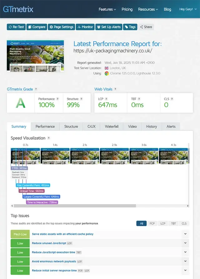
Testing With Real Metrics
We do not rely on guesswork. Tools such as Lighthouse, WebPageTest, and GTmetrix help identify bottlenecks and show how pages behave on mobile connections. We pay attention to layout stability, interactivity, and real user experience signals, not just a single headline score. Testing is performed across browsers and devices to ensure that performance improvements do not break layouts or functionality.
Keeping Performance Strong After Launch
Speed can drift over time as new plugins are installed, new images are uploaded, and new content blocks are added. We help prevent performance regression by setting guidelines for image sizes, monitoring key pages, and making periodic improvements where needed. That keeps your responsive site light, quick, and reliable as it grows.
Your Peterborough audience expects fast pages on mobile - we build responsive sites that meet those expectations without sacrificing design quality.
How Is Responsive Website Design Priced in Peterborough?
Costs for responsive website design vary because different businesses need different outcomes. A simple, well-built responsive brochure site is a very different project to a multi-service website with bespoke integrations or an ecommerce store with hundreds of products. For Peterborough organisations, the best way to think about pricing is to look at what drives effort and what level of quality and support you want after launch.
What Influences Price
Project size is a major factor. The number of unique page templates, the amount of content to create or migrate, and the level of design work required all affect cost. A website with one core template and a handful of pages will take less time than a site with multiple service layouts, location-specific pages, case study templates, and complex navigation.
Functionality also matters. Features such as ecommerce, booking systems, membership areas, quotation tools, integrations with CRM platforms, or advanced forms can increase build time because they require more development and more testing across devices. Even seemingly small requirements, like multi-step forms or custom calculators, can add meaningful complexity when they need to work smoothly on phones.
Design Depth and Content Work
Responsive design is most effective when content is structured for mobile users. If your site needs copywriting, photography, icon sets, or a reworked information architecture, the project includes strategic work as well as build work. That improves conversion rates and makes the site easier to navigate, but it adds scope compared with reusing existing content without changes.
Performance, Accessibility, and Testing
Quality responsive builds require thorough testing. Checking multiple browsers, device types, and screen sizes takes time, especially when performance and accessibility are treated as priorities rather than afterthoughts. If you want a website that loads quickly, avoids layout shifts, and is comfortable to use on mobile, the build needs performance work, not just visual design.
What a Proposal Usually Covers
A clear quote should outline what is included, such as discovery, wireframes, design, development, device testing, launch support, and any content migration. It should also clarify what is not included, for example additional page templates, paid plugin licences, or ongoing support beyond launch. That transparency helps you compare like for like.
Ongoing Support and Ownership
Some projects include only the build and launch. Others include training, post-launch monitoring, and ongoing improvements. Support can cover updates, security, performance reviews, and iterative conversion improvements based on analytics. Deciding what you want after launch helps shape the best-value proposal.
If you have a fixed budget, we can often phase the work, starting with the pages that drive the most enquiries and improving the rest in planned stages. That approach keeps quality high while giving you a clear path to ongoing improvements as results come in.
In practice, the right budget is the one that matches your goals. If the website is a key lead source for your Peterborough business, it should be treated as a sales asset, not a box-ticking exercise.
Responsive web design is one of the smartest long-term investments you can make in your Peterborough business, because it improves usability, credibility, and results across every device.
Do You Provide Ongoing Support After a Responsive Website Launch?
Yes. A responsive website launch is an important milestone, but it is not the end of the work. Devices change, browsers update, and your business evolves. For Peterborough organisations that rely on their website for enquiries and sales, post-launch support helps protect performance and ensures the site stays usable and secure over the long term.
Maintenance and Updates
If your site runs on a CMS, updates are part of healthy ownership. Core software, themes, and plugins need security patches and compatibility updates. Without them, sites become vulnerable or start to break in subtle ways, particularly on mobile where small layout issues can have a big impact. Ongoing maintenance keeps the site stable and reduces the risk of surprises.
Security, Backups, and Peace of Mind
Support should also cover basic resilience. That includes backups, monitoring for unusual behaviour, and practical security hardening. If something goes wrong, being able to restore quickly can protect revenue and reputation. For many businesses, that level of reassurance is as important as new features.
Device and Browser Compatibility Checks
Responsive sites should be checked periodically across common devices and browsers. Changes in iOS, Android, Chrome, Safari, or Firefox can introduce new quirks. A quick compatibility review can catch problems early, such as navigation issues, form problems, or spacing changes that only appear at certain screen sizes. This is especially valuable for high-traffic pages like homepages, service pages, and checkout journeys.
Performance Monitoring
Speed is not a one-time job. New content, new scripts, and growing media libraries can slow the site down over time. We monitor performance with meaningful metrics and review key pages to make sure they remain quick on mobile connections. Where needed, we compress new media, refine caching rules, or remove scripts that are no longer adding value.
Conversion and UX Improvements
Once a site is live, real user data becomes available. Analytics can reveal where visitors drop off, which calls-to-action are being ignored, or which pages attract local traffic but do not generate enquiries. Post-launch support can include iterative improvements, such as refining forms, adjusting page layouts, improving internal linking, and clarifying content to match search intent for Peterborough queries.
SEO and Content Quality Checks
Search performance can shift if content changes, if pages become slower, or if technical issues creep in. Ongoing support can include periodic checks on indexing, broken links, redirects, and on-page consistency. It can also help keep local signals strong by ensuring contact details and service area messaging remain clear on every device.
Content and Growth Work
Businesses rarely stay still. You may add new services, launch new products, expand service areas, or update branding. Having ongoing support means your website can evolve without breaking responsive consistency. We can also help with structured content additions, ensuring new pages follow the same responsive rules and performance standards as the rest of the site.
Reporting and Prioritisation
Good support is not reactive only. We can agree a simple cadence for reviewing priorities, so improvements are planned and measured. That keeps work focused on what will have the biggest impact, whether that is speed, usability, conversion, or new content.
Ongoing support keeps your Peterborough website responsive, fast, and reliable, so it continues delivering results long after launch.
More Of Our Website Services
Serious about growth? Our SEO, PPC, and web services combine proven expertise with modern AI-aware optimisation. Explore what we can do for your business.